Excelsior University Logo
The Excelsior logo was a group design effort. The final logo was modified and refined to completion by me, based on a concept presented by a vendor. Some of the logo designs and sketches presented on this page were concepted, inspired or informed by group work.
Research & Concepting
Logo Sketching
Art Direction
User Testing
Refinement and Finalization



The Need for a New Logo
Excelsior College was becoming a University. This was an opportunity to redesign the logo which had been in need of an update for years.

Concepting and Sketching
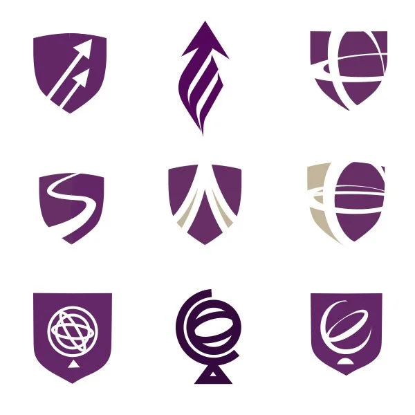
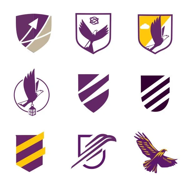
Early ideas included keeping with the existing globelike symbolism and since Excelsior is latin for “ever upward” many also contained angles, arrows, eagles, sky and stars. This is to show the design process and a few of these sketches were designed by others.


Emerging Favorites
A couple of concepts became the favorites based on user testing. In the end leadership decided to move away from the eagle concept because of competitor similarity.


Logo Finalization
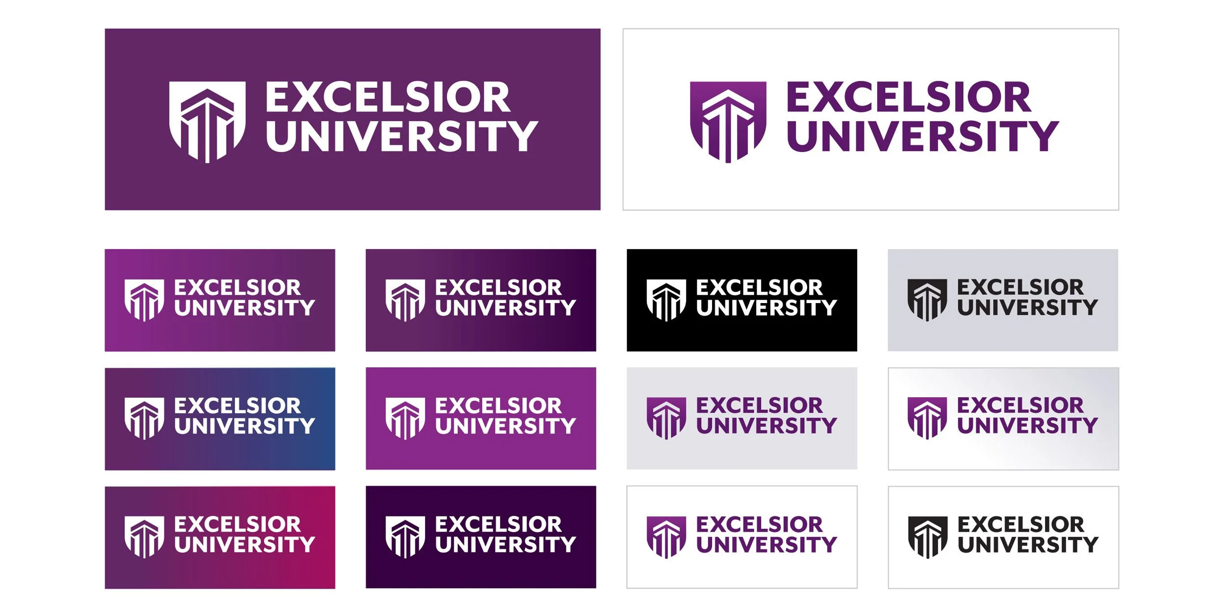
After some user testing revealed that many thought the chosen arrow concept (vendor design) felt militaristic, some referring to it as a spartan helmet. We decided this was enough of a concern that it needing to be addressed, so I added the shield container which softened the feel and fixed the issue as evidenced by user testing.

Optical Illusion
Another change to the final was needed. I created 2 slightly different versions of the logo, one white and one dark. The change was to compensate for an optical illusion created when recoloring the logo which made the arrows in the logo look like different widths.


